Skin Dynamics
Beauty Evolves,
Naturally
Cosmetics Product Line Design

Art Direction
Product Packaging
Visual Identity
Web Store
Marketing Strategy
Brand Story
About the Brand
Skin Dynamics, created by renowned cosmetologist Sayantan Das, is a transformative beauty line designed to empower individuals dealing with various skin-related concerns. With a soothing violet aesthetic, the brand brings a sense of calm and sophistication. Targeting both men and women, though primarily focusing on women, Skin Dynamics offers a comprehensive range of products that deliver exceptional skincare solutions without breaking the bank. Its core philosophy is rooted in the belief that beauty should be accessible to all, offering high-quality skincare that nurtures, heals, and enhances, all while remaining budget-friendly.
Nurturing your skin’s glow,
no matter what life brings your way.
Objectives
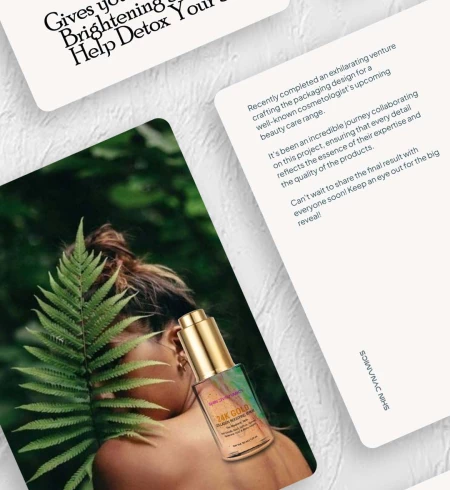
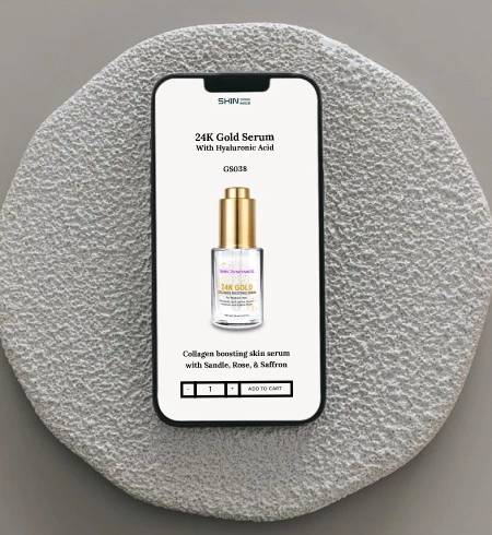
Skin Dynamics approached me with a distinct vision: to craft a product line design that would firmly establish its presence in the market. They sought packaging that would be visually impactful and high-quality, standing out on shelves and digital platforms alike. My role also included designing a captivating e-commerce website and developing a strategic, unified social media campaign to amplify the brand’s reach and appeal.
Scope of work
- Design distinctive, premium packaging for the entire skincare collection.
- Build an intuitive, visually engaging e-commerce site.
- Craft cohesive, eye-catching social media campaigns that enhance brand visibility and recognition.

Problem
A mismatched Visual Story where everything goes in the different direction
While the products and services offered by the brand are exceptionally high-quality, the visual story did not align with this premium standard. Without a clear direction, the brand appeared inconsistent and unfocused, which diluted its market impact.
The inconsistent approach to outsourcing
has severely undermined the brand’s appearance, resulting in a failure to capture attention in a competitive market.
A disjointed approach created a fragmented brand experience, diminishing market impact and perceived value.
To address these issues, I streamlined the visual identity with a premium, cohesive look and feel, ensuring alignment across packaging, e-commerce, and social media. This approach enhanced the brand’s presence and established a strong foundation for consistent, impactful growth.


Approach
With my clear vision and understanding of the core issues affecting the brand, I recognized the implications of neglecting identity.
This often occurs when entrepreneurs, eager to save costs, outsource work that lacks cohesion and complementary elements.
While it’s understandable that individual entrepreneurs with limited resources may hesitate to invest in brand visuals when there are more pressing matters at hand, this approach can ultimately harm the brand in various ways.
Therefore, prioritizing a cohesive visual identity is essential for long-term success and market presence.
In the following sections, I will outline my approach and showcase the actual work and designs I’ve produced to address these challenges.
Result
Primary Font
Montserrat
Aa
Aa Bb Cc Dd Ee Ff Gg Hh Ii Jj Kk Ll Mm Nn Oo Pp Qq Rr Ss Tt Uu Vv Ww Xx Yy Zz
1 2 3 4 5 6 7 8 9 0
! @ # $ % ^ & * ( )
Secondary Font
Poor Rechard
Aa
Aa Bb Cc Dd Ee Ff Gg Hh Ii Jj Kk Ll Mm Nn Oo Pp Qq Rr Ss Tt Uu Vv Ww Xx Yy Zz
1 2 3 4 5 6 7 8 9 0
! @ # $ % ^ & * ( )


Next Case Study
SanX Million →
")
LET’S BUILD
YOUR BRAND
WE’RE EAGER TO GET TO KNOW YOU
AND YOUR STORY.